2028 Los Angeles Olympics Unveiled The Ever Changing "A" Olympic Logo
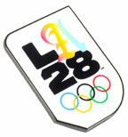
 The 2028 Los Angeles Olympic logo itself is relatively straightforward...a sans serif typeface and a representation of the Olympic rings. The A is where the life of the logo begins.
The 2028 LA Olympics could not be represented “by one singular idea or theme”, so the decision has been made to instead implement an “ever-changing” emblem at its heart. Athletes and celebrities across Los Angeles have had a hand in the 2028 Olympics logo, contributing their own versions of the ‘A’ to create an ever-changing symbol.
According to LA28’s chief marketing officer, Amy Gleeson, the emblem has been created with the digital age in mind. and is designed to reflect the spirit of the city, and stay “fresh” and “connected” in the eight-years leading up to the LA Olympic Games. The decision to bring the games to the city was officially made by the International Olympic Committee (IOC) back in 2017. The 2028 games will mark the third time the Californian city has hosted the sporting event. Previous editions were held in LA in 1932 and 1984.
The emblem is made up of two main elements: a “strong and bold” foundation comprised of the ‘L’, ‘2’ and ‘8’, and a “dynamic ‘A’”, which is constantly changing, representing the many components of Los Angeles, CA.
Recent Posts
-
Collecting MLB Stadium Pins
What pins do you collect? For MLB fans who attend games across the country it is a easy answer....S …28th Jun 2023 -
2028 Los Angeles Olympics Unveiled The Ever Changing "A" Olympic Logo
The 2028 Los Angeles Olympic logo itself is relatively straightforward...a sans serif typeface and a …30th Dec 2020 -
The Rare Opening and Closing Ceremony Pins Are Back For The 2020 Tokyo Summer Olympics
Due to the change in licensing over the years, we have not seen the very popular and collectible Ope …9th Oct 2019
